WELCOME to Spokanvas!

Whitworth University offers a course about Community Arts. This blog offers the students in the course and the community an opportunity to share what they see going on in the area and open up a discussion. Thanks for stopping by and keep checking in!

Monday, October 24, 2011

Saranac Comes to the Spokane Falls Fine Art Gallery

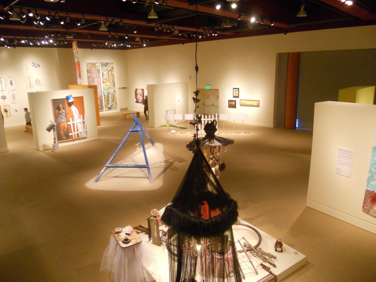
The show that I attended was the Saranac at the Falls. Artworks were made by many local artists. Our very own Katie Creyts and Scott Kolbo had some of their art displayed there. This show also featured the work of Dani Pavlic, Nancy Hathaway, Jeff Huston, Christ Tyllia, Cori McWiliams, Lisa Nappa, Shelly Williams, Dan McCann, Carrie Scozzaro, Lance Sinnema, Jen Erickson, Roger Ralston, Margo Casstevens, Kurt Madison, and Matt Boland. I was not familiar with any of these other artists.

The gallery consisted of many varied works. There were a number of art styles including painting, drawing, sculpture, and videos. The materials used were charcoal, wood, metal, ink, paper, digital print, ceramic, copper, gesso, glaze, oil, graphite, aluminum, panel, glass, rice paper, rubber, and nails. Most of the art was mixed media. So this was a very diverse exhibition.

I think bringing such a unique show to the Falls gives the students there, from other schools (like Whitworth), and local artists a chance to explore many styles of art. Because the gallery itself is small, artistic interactions are more likely to spark.

The piece that I chose to study more closely was Lullaby by Katie Creyts. After studying the piece, interviewing Katie, and reading her artist statement I got a pretty good idea of what her work is all about. Her main focus is fairytales and the real world, conversely. Another theme of hers is femininity. She uses a light, transparent dress as the main focus for her sculpture. I assumed there were rocks in the front pocket until I interviewed Katie and found out that they were actually mice made of glass. That is the effect she hopes to produce, it’s about discovering little things like that. The fact that no one is wearing the dress gives room for the viewer to create their own story. The dress basically serves as springboard for making fantasy.

The materials used for this piece are simple, mesh cloth and glass. In terms of physical and visual mass, they balance each other out. This was the way I originally interpreted the work. I thought it was just two types of materials put together to create equilibrium. There is actually so much more here than just formal balance. There is also a conceptual balance as well. In this context, the mice are seen as repulsive, while a dress represents beauty. It’s this combination of attraction and repulsion that stabilizes the piece too. So I think balance is major principle at play here.

Personally, I find looking at Katie’s artwork very nostalgic. All the stories the sculptures provoke the viewer to conceive remind me of cartoons that you watch as a kid. It really makes you ponder about your childhood and evokes some long-forgotten memories. I don’t think I’ve ever seen art such as this. Does the piece Lullaby remind you of some part of your childhood? If not, I suggest looking at other sculptures by Katie Creyts.


Work Cited


Creyts, Katie. "Interview with Katie Creyts." Personal interview. 18 Oct. 2011.


"Katie Creyts Artist Statement." Katie Creyts. Web. 24 Oct. 2011. .

Sunday, October 23, 2011

Seeing Impressionsim


Seeing Impressionsim

An exhibit entitled Seeing Impressionism opened at the Northwest Museum of Arts and Culture on October 14th. The exhibit featured works of artists in Europe, America, and specifically the Northwest. When the French Impressionists began to paint in this impressionistic manner, they “ignited a revolution” which would go on to become one of the most influential art movements in art history. Impressionism, which traded “500 years of academic rules” for “bright colors and short brushstrokes”, can be credited for the birth of modern art.

We are fortunate to have such a wide variety of works on display here in Spokane, some of which French Impressionists Renoir, Degas and Pissarro, as well as American artists Glackens and Prendergast. The exhibit will be on display until February 25th, 2012.

One eye-catching piece on display was a work by Henri Fantin-Latour. The French artist was well known for his flower paintings, which were typically set against dark backgrounds, creating a vibrant contrast. Latour was considered more traditional in his impressionistic paintings compared to other Impressionists of the time. Still, we can clearly see Latour’s inspiration by impressionism’s bright colors, vibrant light and visible brushstrokes, which he used to create his meticulous flower still lives. This specific piece on display is incredibly eye catching. Its pink and white petals set against a dark background seem to illuminate the flower itself. I found it incredible to see how much detail could be conveyed through such simple brushstrokes. Henry Fantin-Latour was just one of the many incredible artist on display in this exhibit, and I highly encourage you to take a trip down to the MAC and see for yourselves this impressive collection of works (they will be on display for the next 4 months so you have no excuse!) And while you’re there, compare the differences in the artist’s styles of impressionism. Can you also see which characteristics they all have in common? Enjoy!

Works Cited

http://www.northwestmuseum.org/index.cfm/Calendar.htm

Seeing Impressionism exhibit. Northwest Museum of Arts and Culture. 14 October 2011.

Territory- at the MAC


Territory- at the MAC

The compilation of Territory is eccentric, intriguing, and moving. The premise of the show is to question the uncharted territory whether or not what we need is the same as what we want. There are several prompt questions offered at the beginning of the show: What do we need as people? What do we need as a nation? What do we merely want? Is there any difference? The pieces are imaginative and yet morally striking as well.

For example, the first piece at the entrance of the Territory exhibit is a bright red children’s readymade Radio Flyer wagon with a Nintendo 64 game consol remote control attached to it. To me, this represents the tension that exists between vibrant imaginations children seemed to have before video games came into play and invented their imaginations for them. Do we want our kids to be given a wagon and open up a world of possibilities for themselves or do we want our technological world to thrive and plant ideas in our kids’ minds before they build their own? The artist of this piece, Juventino Aranda was successful in this piece of art, conveying the very fine line between “need/want”. The art in this exhibit is relatable to so many people because the pieces are the product of the artists’ imaginations uninhibited and completely revealed. Aranda’s work reflects the mindset of many of the other artists present at this event.

What struck me about so many of the pieces, were the pairings of very realistic things with imaginative fantasies. As if much of the show were exhibiting what it might truly look like if our imaginations came to life; a collection of our daily thoughts and daydreams put together as one. Along with many other pieces that were profoundly executed, a couple pieces that drew this discovery out from me were the contributions made by our very own Katie Creyts who partnered with Kay O’Rourke. There were also several pieces that used a 2D image accompanied with 3D elements. Such as a painting highlighting a painted man holding a real-life brush. This factor allowed me to wonder about the question of reality and meaning. What were the meanings behind the artists’ choice to specifically emphasize the brush? What pieces of our own lives to we objectify or make more prominent? What do these choices say about our reality? Just as there is a question about absolute truth, is there an absolute reality?

Friday, October 21, 2011

Bruce Herman's "Face to Face" (a reflection)


I don’t typically go around appreciating art. However, when I walked into Bruce Herman’s “Face to Face” art exhibit in the Bryan Oliver Gallery at Whitworth this past September and saw Bruce’s father looking back at me, I knew I was in for something I hadn’t expected. This exhibit conveyed meaning more effectively than words could have.

The theme of the art exhibit was faces and what they portray. As Bruce says in the description of the exhibit, it was about conveying the “elusive quality of real presence—the internal person, not just their appearance.” Looking into the eyes of each portrait filled me with a surprising amount of feelings, many of which I couldn’t understand at first. On a technical level, many of the paintings were composed of thick paint layered on so it looked nearly three dimensional—the layers symbolic of the complexity of the human spirit, perhaps.

A couple paintings stood out to me. In the center piece of the painting entitled “The Virgin Miriam”, there is a woman (likely supposed to be Miriam). She is, unlike most of the paintings in which the subject’s face appears to be the focal point, fixated on a point not near the viewer. Strangely, this was one of the only paintings where I felt the subject was looking straight at me. She was sprawled out on the ground, peering with pleading eyes. A central theme in the exhibit was vulnerability and no subject was more vulnerable. I felt like I shouldn’t be looking at her, like I was seeing something very private. I sensed pain on multiple levels— not only physical, but a great deal of mental pain.

A different kind of vulnerability was evident in Herman’s self-portrait. It looked strangely as if Bruce was not entirely “there” during the moment captured in the painting. It reminded me of someone deep in thought or perhaps not thinking at all. Whenever we space out and someone catches us though, we immediately snap back to normal. This is because when we are lost inside or own heads, we often forget to put up the masks which we normally wear. So it is interesting that Herman decided to paint himself in this moment. Does Bruce feel as if he is always being caught with his guard down? Or does he constantly feel lost...disconnected?

Herman packed more emotion into these people’s faces than could be possible in real life. Not quite understanding how it was possible, I decided I needed to look at the paintings up close to analyze what was creating these feelings. I expected to reach out and feel something living, breathing. I found myself surprised to be observing simple brush strokes on a canvas. How could little dots of paint convey something so powerful?

Tuesday, October 18, 2011

Northwest Designer Craftsmen at the Chase Gallery from 8/30/2011 to 10/28/2011


Northwest Designer Craftsmen at the Chase Gallery from 8/30/2011 to 10/28/2011

The current show at the Chase Gallery downtown Spokane at city hall features the Northwest Designer Craftsmen (NWDC). This unique organization started in 1954 to promote Artists in Washington, Oregon,Idaho, Montana and Alaska. The organization has always strived to maintain excellence of design and craftsmanship in clay, wood, glass, metal, fiber, and/or mixed media. In addition NWDC tries to raise the public's appreciation for fine craft.

The artists featured are:
Barbara Barnes Allen, Seattle, WA, Joline El-Hai, Seattle, WA, Gina Freuen, Spokane, WA, Deborah Gregory, Bellevue, WA, Carol Gouthro, Seattle, WA, Lin Holley, Seattle, WA, Lars Husby, Seattle, WA, John H. Killmaster III, Middleton, ID, Patty King, Seattle, WA, Jan Koutsky, Seattle, WA,Cheryll Leo-Gwin, Redmond, WA, Margo Macdonald, Vaughn, WA, Linda McFarland, Seattle, WA, Dorothy McGuinness, Everett, WA, Donna Prichard, Bellevue, WA, Denise Snyder, Bellingham, WA, Judy Zugish, Marysville, WA


These artists have clearly mastered craftsmanship in mixed media, kiln-formed Glass, enamels, ceramic, porcelain, quilting, terrecotta, slip-casted glazes, underglazes, gold leaf, patinas, glazes, ceramics-stoneware, polymer clay and acrylics, fiber, hand woven tapestry, cloth, watercolor paper, waxed linen, fiber–collage, fiber–mixed media, paper maché and basketry.
The feel of the show was somewhat abstract yet very uniform in the overall theme of mixed media craftsmanship. The quality of the work is exceptional especially the creativity and the acute attention to detail. I found the more I looked, the more I wanted to look closer. Although some of the pieces were simplistic other pieces had more than enough complexity to balance it out. I highly recommend taking the time to check this show out. If you miss this one, you'll be missing a real treat! Jeff Ferguson


Work Cited: Northwest Designer Craftsmen at Chase Gallery

Monday, October 17, 2011

The Archie Bray Foundation at Kolva-Sullivan

October 7th 2011, the Archie Bray Foundation displayed several of their artists at the Kolva-Sullivan Gallery. This gallery works entirely with artists who specialize in the use of clay. The Archie Bray Foundation or the Bray is an educational institute based in Helena Montana that provides greater emphasis on ceramic art forms, both in the contemporary and the traditional practice.

For this show, there was a diverse variety of pieces being displayed ranging from contemporary to traditional, functional to non-functional and humorous to serious. This show attracted a wide audience as well. When I attended there were anywhere from 15 to 20 people circulating both rooms and ranging from the age of infants to the elderly. However, something that tied all of these people together was the great joy that they experienced from looking at these pieces. It was enjoyable to see strangers talking and laughing amongst themselves and pondering over the art displayed before them.

Some of the pieces that were most influential to me were the piece titled Amphora by Adam Shiverdedra and Ant Bowl, Mug and Tumbler by Andrew Gilliat. The thing that attracted me the most to Amphora was the structure and how the components were opposites of one another. Constructed from porcelain and steel wire covered in rough reddish brown clay, it appealed to me that something so fragile could be paired with something so harsh. Having worked with ceramics before I can appreciate how difficult it would be to not only throw porcelain but then create it to fit with a wire mesh. Adam clearly is talented in this area and not only managed to combine these two substances but he created them to appear to be one piece. Andrew Gilliat also used porcelain for his pieces but took a more traditional approach to his pieces. The shapes of the pieces of themselves cling closely to what would be expected from dining sets. However, the thing that made these pieces interesting to me was the print on them. Running in diagonal lines, there are a series of red ants. To me this was incredibly ironic because the pieces themselves mimicked a picnic attitude but the print on them was covered in ants. This is the exact opposite of what you would want to have on your pieces for a picnic and this combination between the delicate and grotesque is incredibly unique.


.Ant Bowl, Mug and Tumbler


Andrew Gilliat


Close up of Ant Mug
Andrew Gilliat


Amphora


Adam Shiverdedra


Terrain 2011!


The Terrain Festival this year was amazing. No genre was left un-represented. Video art, sculpture, printmaking, pen and ink work, and even performance art and poetry. Spokane's historic Music City Building was filled to the brim with art, and artists alike.
With 150 works of art, and thousands of people there to see them, the overall feeling of the event was that of a unbelievably supportive artistic community, the likes of which I had never seen. It made me proud to live in Spokane. Needless to say, the spectacle was a tad overwhelming, exactly the way it should be.
I'd love to be able to gloss over the entire event with a skillful overview of the works present, but that would be impossible. Instead I thought I would bring to light the work of Morgan Rose Lynch. Had I not been leaning up against a wall listening to one of the many impressive bands that played that night, I might have missed it. Her only contributions to the event were two 10x6 paper cutouts hung up on a pillar that ran somewhere through the middle of the building. They were small, understated, smart, and absolutely hilarious. I couldn't get enough of them. On first glance, I enjoyed them, after reading her artist's statement, I fell in love with them. It read, "My name is Morgan Rose Lynch. I like History. Maybe you think history is boring, but that's ok. I also like jokes. I bet you do too". Upon reading her statement, my face lit up with a smile that didn't fade all night. It was perfect, short, and hilarious. Her two pieces were entitled, Napoleon Trombonapart (pictured above), and Banjoseph Stalin. Which as you might have guessed featured the infamous Napoleon Bonapart playing the trombone soulfully, and Joseph Stalin on banjo.
I absolutely loved her two piece's, and had they not already been sold, for the meager price of $50 a piece, I would have bought one. And to me, I think that means that terrain this year was a complete success. Art was created, art was shown, and art was sold, the cycle continues. Keep supporting America's young artists!